Archives

Friday, January 30, 2009

The shaky future of the American internet

Comcast Cares
Bandwidth restrictions in the US are a relatively new idea. Most Americans pay their monthly bill, and then use their connection however they please. However in the past few years, we have seen ISPs such as AT&T and Comcast trying their best to throttle, cap, or filter their customer's internet access.

Around November of 2008, AT&T started testing methods of bandwidth capping in Reno, where they placed a limit on how much their customers could download from anywhere between 20GB and 150GB. Going over the cap would penalize you at the rate of $1 per GB.

They have also recently been tinkering with content filtering systems that would use technology developed by the company Vobile to identify copyrighted media and illegal content based on its audio and video data using VideoDNA.

On October 1st of 2008, Comcast stepped up with one of the biggest setbacks to free use of the internet with their Acceptable Use Policy, which placed a 250GB cap on monthly data usage. They sent out an announcement to attempt to justify the cap.

“To put 250 GB of monthly usage in perspective, a customer would have to do any one of the following: Send 50 million emails… Download 62,500 songs… Download 125 standard-definition movies…Upload 25,000 hi-resolution digital photos”

This policy is still being enforced today. If you continually go over the cap, Comcast will either ask you to upgrade to commercial tier internet access, or terminate you as a customer.

Many people said that the 250GB cap was completely reasonable, and that to go over the limit you would have to be doing incredible amount of p2p. I would agree that 250GB is much more than most people will ever use, however my issue with the restrictions aren’t whether the quota is reasonable or not. My issue is that these restrictions could be the starting point of a slippery slope, where ISPs add more and more restrictions so that they can cram as many users as possible into their network without upgrading their infrastructure.

Another issue is that bandwidth intensive applications are constantly being added to the internet. Youtube, Vimeo, Netflix etc. all recently rolled out their HD video options, which consume around 2-5x more bandwidth than standard definition videos. If the 250GB cap doesn’t increase with average user consumption, the average user may have to start limiting the amount of time they spend on the internet within the next few years.

If more ISPs jump on the bandwagon, it may not be possible to choose a service that allows you unrestricted access to the internet in the future.

For a glimpse of how awful internet access providers can get, take a look at any Australian ISP. For about the same price as an American provider charges for a basic package, an Aussie will get capped at somewhere around 20GB. Monthly caps are just the start of an Australian internet user’s woes. They are also subject to censorship second only to communist China. Australia currently uses two blacklists. One is mandatory for all Australian citizens, and the second filters out content not suitable for children, which can be opted out of.

Chris Illingworth knows all too well about the backward internet laws of Australia. What got passed as a law that would “save the children” ended up nearly ruining his life after he uploaded a video of a child being tossed in the air. Chris was not the author of the video, he found it on one site and merely uploaded to another. His home was raided on Sunday, November 30, by Queensland Police from Task Force Argos, which specializes in combating child pornography. He is being charged with using the internet to access and publish child-abuse material, and is currently fighting the charges in court.

While American internet access is not yet nearly this bad, new restrictions that seem harmless could be wolves in sheep’s clothing. Getting the consumers to allow their ISP to give them bandwidth quotas, filter their content, or throttle down their speed was the hard part. Imposing further restrictions in the future will be much easier.
Read More >>

Fuji FinePix F50fd

The F50fd has an attractive yet ergonomic design, with a slight curve that your shutter release finger curls around. That finger can also easily reach the power and image stabilization buttons, as well as operate the zoom lever, which encircles the shutter release. All of the other controls are located on the right hand side of the camera back, within easy reach of your thumb.

The rear mounted control dial turns smoothly but not so smoothly that you're likely to turn it inadvertently and provides access to automatic, aperture priority, and shutter priority exposure modes, as well as a video mode and two photo scene mode notches that can be programmed to activate any of 14 options. A panorama mode is notably missing, but there's an underwater mode for use with Fuji's compatible underwater housing.

For low light shooting, the dial also provides Natural Light and Natural Light & Flash selections. The first boosts the ISO setting and turns off the flash, while the second takes two shots in quick succession, one with flash and one without.

The remaining option on the dial is the somewhat misleadingly named Manual mode. It doesn't provide fully manual exposure controls but instead calculates exposure automatically and provides access to metering, white balance, and auto focus mode selections that are not available in the fully automatic shooting mode.

Those controls are also available in the priority modes. Other physical controls include a review mode button, a button for activating face detection modes, and a display button that turns off icons or activates a rule of thirds grid overlay. As is typical in Fuji cameras, the menu system is split between the main menu button and a function button a setup that makes the menus short and quick to navigate.

My only complaint about the menu system is that, as in other Fuji point and shoots, the menu turns off when you make a selection so that you have to reenter the system for each setting change. The menu button also serves as a center OK button for the four way controller, which itself provides direct access to exposure compensation, flash settings, the self timer, and a macro mode. Overall, the F50fd's control layout is efficient and comfortable to use. Covering the rest of the camera's back is a 2.7 inch LCD that shows a clear, detailed image and remains viewable in most lighting conditions, as well as when it's held at high and low angles and off to the side.

You can not only adjust its brightness but also change the camera's power setting to boost the screen's clarity and refresh rate other power options include a mode that maximizes the auto focus speed and one that extends the battery life. Another nice component of this camera's design is its memory card slot, which is more likely than most to be compatible with cards you already own; accepting either SD/SDHC or xD-Picture Card media.
Read More >>

Fuji FinePix Z5fd

The Z5fd is stylish looking, with a well constructed metal body. When opened, its sliding front cover turns the camera on to expose the 3X zoom lens and built in flash. A small number of buttons puts essential controls at the photographer's fingertips. These buttons also provide one touch activation of a face detection mode and a digital anti blur mode that boosts the shutter speed and ISO setting to capture sharper automatic shots.

Another function button on the camera provides quick access to quality, ISO, and color settings. Not every feature gets a quick access button, however exposure compensation and continuous shooting modes are among those that don't.

You have to go into the main LCD menu to use them. The Z5fd is oriented toward automatic shooting and provides just 12 scene modes, in addition to natural light and natural light + flash modes.

The latter takes a quick pair of shots, one with flash and one without, and lets you save the one you prefer. The 3X zoom lens offers a 35mm equivalent focal length range of 36mm to 108mm, with a maximum aperture of f/3.5 on the wide end to f/4.2 when zoomed in.

It's an average range, with no especially noteworthy capabilities. In most situations, Z5fd's 2.5 inch LCD viewfinder works well and presents a sharp, clearly visible image. You can adjust not only the display's brightness but also its refresh rate, making your own choice about which is more important a smooth view or battery stamina.

The LCD even has an internal sensor that automatically adjusts the display's gain in low light so that you can see what you're photographing. In bright light it's still fairly easy to use as a viewfinder. Like many of Fujifilm's recent cameras, this model incorporates IrSimple connectivity, which lets you beam images to, and receive them from, compatible devices. IrSimple hasn't been broadly implemented in imaging devices, but it can be a handy way to exchange photos with friends who also have Fujifilm cameras.
Read More >>

Fuji FinePix A920


Designed specifically for the first time digital camera buyer and consumers seeking an affordable, easy to operate upgrade to their current digital camera, Fujifilm's FinePix A920 is loaded with features usually reserved for more advanced models. The camera incorporates Fujifilm's signature Super CCD sensor technology, a 4.0x optical zoom lens and features a 2.7" LCD.
Read More >>

Thursday, January 29, 2009

Apple iMac

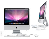
Apple iMacI bet you thought the iMac had everything didn't you? Well you'd be wrong. But it's ok, nobody is perfect. Now the iMac comes with style, brains, and even more power. Lets face it, front side, back side, side view, upside down, which ever way you look at the iMac is great to look at. It has an incredibly slim profile but its definatley the glossy wide screen display framed in anodized aluminum and its glass cover that does it for most people. Coming in a 20-inch and 24-inch size the iMac makes your pictures and movies come alive with incredible color. Did I mention that the iMac is made with recyclable glass and aluminum? Just a side note for those of you who perfer to go green. But the monitor isnt the only thing going for that slim physique. The iMAc's keyboard also is adorned with anodized aluminum. It features crsip keys that allow for a more responsive feel, special function keys for one touch control of Mac features and 2 USB 2.0 ports that provide high-speed connectivity to your iPod, digital camera or anything else you need.

Did I mention that the iMac was pretty? Anything you view on your iMac will be a work of perfect pixel. The iMac has a flat-panel LCD screen with 1680 by 1050 resolution on the 20-inch and a 1920 by 1200 resolution for the 24-inch. The iMac offers the latest Intel Core 2 Duo processors that run at a speed of up to 3.06 GHz with advanced 45-nm process technology and 6MB of shared L2 cache. Don't speak tech? This means that the iMac runs your applications faster and better than ever before!

The iMac has up to 2GB of 800MHz DDR 2 memory standard to allow you to run more applications simultaneously and you can load up on photos, music, and videos with a serial ATA hard driveup to 320GB. Graphics more your style? The iMac comes with the ATI Radeon HD graphics standard. You also get the oppurtunity to upgrade to the most powerful graphics ever available in an iMac with the NVIDIA GeForce 8800 GS and 512MB of dedicated video memory! Also with the iMac you get Leopard, the latest version of Mac OS X, loaded with features like safari and even something called boot camp that lets you start up your Mac in Windows. And, because its a part of every new Mac, you'll get iLife '09 with iPhoto, iMovie, GarageBand, and iWeb.

You can get all this for a starting price of $1199, well worth it if you want a high quality computer loaded with tons of features.
Read More >>

Audio Smileys

Audio Smileys is a cute little application that allows you to play funny sounds to express your feelings. It is mostly targeted for youngsters, but of course, anyone can use it for fooling around with friends, or pulling pranks at co-workers. Once launched, just press keys 1...9 on your keypad to play the sound. In addition, you can create your own audio smileys with the built-in audio smiley editor.

Free Download: here

(Should work on all (requires Java version CLDC-1.1 and MIDP-2.0.) latest Nokia devices based on S60 or Series 40, with traditional keypad. Partially works on devices with QWERTY-keypad (only the center key can play sounds). Does not work on touch screen devices.)
Read More >>

SCVMM 08 VLAN ID migration error

hi

I have 29 VM with Hyper-V.
I am changing some of them with SCVMM08 migrate option.
The source server doest have a trunk.
The target server has a trunk.
If I migrate a VM without Vlan id to another server without vlan id, I dont have any problem. The migrate wizard inside SCVMM07 runs well.
If I migrate a VM withou VLAN ID to another server with VLAN ID, I have a problem.
The VM migrate, but I need to assign the VLAN ID by hand.
Is there any option to do that with SCVMM08?

I dont know. ;-(
sAntos
Read More >>

P2V migration. Physical to Hyper-V

hi

the SCVMM08 has an option to convert a Phisical machine to a virtual machine.

Dont you have SCVMM08?

I liked this url:
http://easterndigitalsoftware.com/p2v/p2v.htm

Always I thought in that but with some changes.

It is a good solution, isnt it?

Santos Pardos
Read More >>

Deep Zoom Tool For Microsoft Advertising


For the last month, we have been working on a Silverlight based sales tool for Microsoft Advertising and I'm pleased to say that it has now gone live!

The Sales team is to use this tool to show the advertising opportunities across the entire set of Live based sites including the new Home site, SkyDrive, Mail and Messenger among others.

The tool utilises the new Deep Zoom technology to provide a really cool and intuitive interface for viewing the advert space available across these sites. The information is given to the user through a Hotspot system that displays the advert information when the user hovers over an advert on one of the pages.

Download a copy and have a play for yourself by visiting www.windowslivetogether.com.

I have put together a quick screencast that will show you how to get set up and explore the features the tool provides.


Have Fun!

Read More >>

Fuji FinePix Z10

The 7.2 MegaPixel FinePix Z10fd features an ultra portable design, making it easy to take this sexy micro mini camera anywhere you go and it comes in five brilliant colors to match the latest styles of today's fashionistas Wave Blue, Wasabi Green, Hot Pink, Sunset Orange, and Midnight Black.

It also sports a Fujinon 3x optical Zoom lens, 2.5" LCD screen and packs 54MB of internal memory to give you some extra room when your memory card has had its fill.

With its stunning high resolution LCD, the FinePix Z10fd also has a cool new slideshow mode from Fujifilm that let's you view and share your photos spontaneously with friends with music provided to help set the mood.
Read More >>

Fuji Finepix F40fd

The F40fd's design is pleasingly minimalist. It measures a somewhat slim 2.3 by 3.8 by 0.9 inches and weighs 5.1 ounces. The camera features 3X optical zoom with an 8 mm to 24 mm range (which is equivalent to a 35mm lens with a 36 mm-108 mm zoom) and corresponding maximum f-stops of f/2.8 to f/5.1. One of this camera's features I really like is relatively new to Fuji face detection.

The Fuji FinePix S6000fd, a super zoom, also has this function, hence the "fd" suffix. With this feature enabled, when you're setting up a shot, you'll see white squares appear around people's faces on the camera's 2.5 inch LCD. The person closest to the camera gets a green square, and becomes the primary focus of the shot most cameras just automatically focus on the center of a shot with no regard for its composition.

In my testing, this feature was accurate most of the time, in both group and standalone shots. Another handy function is the F40fd's clunkily named "Natural Light and With Flash" two shot mode. This mode comes in handy when you're not sure if the flash is necessary in a given situation. In this mode, with the press of a button the camera snaps two shots in quick succession, one with and one without flash.

The two shots are then momentarily displayed on the LCD side by side. As we noted in the Fuji FinePix S6000fd review, the camera also adjusts its ISO settings when using this function. My "without flash" shot upped the ISO to 2,000, whereas the flash shot went down to 800 ISO. As is typical, the higher ISO shot showed some colored noise. Fuji's Picture Stabilization technology helps you capture clear action shots.

The camera reduces blur by increasing the ISO based on movement, and the company claims it can do so with low noise. In my high ISO test shots (1,600 ISO), the F40fd did a decent job, with some colored noise, but nothing too prominent. Colors and flesh tones retained vibrancy and accuracy. Like most point and shoots, the F40fd does not have fully manual modes, although you can adjust exposure compensation, white balance, ISO, image size, and color settings.

There's even a black and white mode. The F40fd has three burst modes one that saves the first two shots of a sequence, one that takes the last two, and one that saves a continuous stream of unlimited shots. Continuous burst mode was almost painfully slow in my testing the other modes were speedy but saved only two shots. The Canon PowerShot A550 has much better burst modes.
Read More >>

Sony Handycam HDR-SR5

Mostly, however, the SR5 simply confirms my belief that decent HD video will still run you more than $1,000. (But spending another $300 or so to upgrade from the 40GB SR5 to the 100GB SR5C, doesn't count.) If you discount the small touch screen LCD and lack of an eye level viewfinder, the SR5 has a perfectly serviceable design. With its shiny silver and matte black duo tone body, it lacks the sophistication of the 7 series models, but that's pretty typical for the camcorder B-list.

At about 1 pound, 3 ounces, it weighs down a jacket pocket but is pretty comfortable to hold during extended shooting. As you'd expect for the money, it feels solidly built, with nice touches such as a sliding jack cover, an electronic lens cover, and a sturdy tethered hot shoe protector.

The rest of the controls on the body sit in the places you'd expect to find them zoom switch, photo shutter, and power or mode switch fall under your index finger, while the stop and start record button lies under your thumb.

A tiny button for turning on the flash (for still photography) sits between the power and record controls. On the left side of the gripping ridge formed by the hard disk enclosure is the NightShot switch.

Underneath the LCD you'll find the buttons for for completely automatic operation (Easy), cycling through the display options, and launching thumbnail views, plus the slot for the Memory Stick Pro Duo that's required for shooting still photos. Also typical at least for Sony you operate almost all of the camcorder's functions via the touch screen menu system.

As I've said before, and will repeat ad nauseam, the 2.7 inch LCD is too small for comfortable touch screen operation. You have to press the tiny navigation icons with the very tips of your fingers, something that gets even more difficult in colder climes. Thankfully, there are larger, easier to press icons for adjusting exposure compensation, white balance, focus, and choosing scene modes.
Read More >>

Wednesday, January 28, 2009

Solver Foundation

Microsoft’s Solver Foundation (http://code.msdn.microsoft.com/solverfoundation), not to be confused with the Solver Add-In for Excel, is a runtime for various types of mathematical problem solving. The download includes solvers for a number of specific types of problem (Linear Programming, Mixed Integer Programming, Quadratic Programming and Constraint Programming) and enables other 3rd party solvers to be plugged in to the runtime.

The provided solvers cover a more general area known as Operational Research, that roughly speaking is a set of mathematical approaches to find the best (or sometimes nearly the best) solutions to complex problems.

A typical example of a linear programming type problem might go something like this. A global manufacturing company has the capability to manufacture its products at a number of different factories in different countries, and these factories have different costs associated with the manufacturing process and different maximum production capacities. The goods produced need to be transported to their target markets (again there will be different shipping costs for each factory/market combination) and there are forecasts for the amount of each product that will be sold in each market. The problem is to try and minimise the costs involved and therefore maximise profits.

An example of a constraint problem might look like this. You have a set of servers with a range of specifications covering things like; memory, number of processors, disk space, installed web server, installed database server. You also have a set of applications that need to be deployed, and each application has a set of requirements in terms of memory usage, processor usage, disk space, web server and database server. You need to work out which applications should be installed on which machine, possibly taking into account other constraints such as application A cannot be on the same machine as application B, and applications C and D must be installed together.

One of the interesting samples included in the download applies this type of problem solving to search by implementing a guided search mechanism. For example an online retailer sells laptops which can be categorised in different ways; by price, brand, weight, operating system, memory, disk space, processor, extended warranty, rating, etc. The problem in providing a search facility to customers where they can select values for any of these criteria is that many combinations won’t return anything at all, making people think (wrongly) that the choice offered by the site is limited. Guided search solves this problem by limiting the available options based upon previous selections, so for example if I selected price under £1,000 and weight under 2kg I would find that my choice of brands and disk capacity had been limited. Notice that you can’t use a hierarchy to structure your data as you’ve no idea which criteria the user is going to start with as the basis of their search.

So how does this all work with Solver Foundation? The first step is to express the problem as a model, using a modelling language called OML which looks like this:

Model[
  Decisions[
    Reals,
    SA, VZ
  ],
  Goals[
    Minimize[ 20 * SA + 15 * VZ ]
  ],
  Constraints[
    0.3 * SA + 0.4 * VZ >= 2000,
    0.4 * SA + 0.2 * VZ >= 1500,
    0.2 * SA + 0.3 * VZ >= 500,
    SA <= 9000,
    VZ <= 6000,
    SA >= 0,
    VZ >= 0
  ]
];


The decisions are the data we’re working with, the goals are our targets and the constraints are the limitations we have to work with. Translating your real world scenario to this kind of model can take a bit of thought!

The model can then be solved using one of three techniques:

  1. It can be passed to a command line utility.
  2. It can be processed by an Excel add-in (not the Solver Add-in that comes with Excel) that enables you to bind cells to the model for both input and output.
  3. It can rewritten to a .NET managed API that enables finer control over the solver and binding input and output data via LINQ.

The important point to take away from this is that you don’t have to solve the problem, you do need to express the problem using the modelling language and possibly bind the model to external data.

Read More >>

SuperMario Bros for S60

SuperMario Bros for S60SuperMario Bro is a classical game written in J2ME for Symbian phones.

Free Download: SuperMario.jar

via: symbianplanet.net
Read More >>

RIM BlackBerry Pearl 8120

If you were to go on looks alone, you wouldn't be able to tell the difference between the original BlackBerry Pearl and RIM BlackBerry Pearl 8120. We can't really knock the lack of changes to the design either, since you're getting a full featured smart phone in a cell phone like form factor that's pocket able and comfortable to use as a mobile.

The Pearl 8120 keeps the same compact frame, measuring 4.2 inches tall by 1.9 inches wide by 0.5 inch deep and even weighs less at 3.2 ounces. And while the casing might appear to be black, it's actually an attractive deep sapphire blue. The overall design of the RIM BlackBerry Pearl 8120 remains the same as the original Pearl. You do, however, get new interface themes, graphics, and more, including this L-shaped menu.

On front, there is a 2.25 inch nontouch display with a 65.000 color output and 260x240 pixel resolution. It's also equipped with a light sensing technology that automatically adjusts the backlight depending on the environment. All these factors combined make for a sharp and vibrant screen, but RIM also made some enhancements to the user interface to make it more visually pleasing and easier to use.

There are new themes, including an L-shaped menu format, new graphics, fonts, and colors. The changes aren't anything to write home about, but they certainly make for a better user experience.

The SureType keyboard will admittedly give some users some trouble, but also features enhanced word completion for easier text entry.

Below the display, you'll find the same navigation array of previous Pearls, which includes Talk and End keys, the BlackBerry menu shortcut, a back button, the pearl like trackball, and of course, the SureType keyboard.

As we've said many times in the past, the modified keyboard isn't going to suit everyone (present company included), and there is a bit of a learning curve to the text entry. However, we understand that some concessions had to be made in order to fit a QWERTY keyboard into a smaller space. The SureType software also now features improved word completion and an easier way to correct misspelled words, though we didn't notice a huge difference.

Among other things, the left side of the smart phone holds a 3.5 mm headphone jack and microSD or SDHC slot that can accept up to 8GB cards. On the left spine, there's a 3.5mm headphone jack, a mini USB port, a microSD or SDHC memory card slot, and a push to talk button. Meanwhile, the right side holds a volume rocker and a camera activation button.

Both the PTT and camera keys can, however, be reprogrammed to launch other applications if you prefer. There's a mute button on top of the unit, and finally, the camera lens, self-portrait mirror and flash are located on the back.
Read More >>

Nokia E90 Communicator

The Nokia E90 Communicator is a mammoth. The handset measures a whopping 5.2 inches tall by 2.2 inches wide by 0.7 inch deep and weighs 7.4 ounces, so you can pretty much forget about slipping this into a pants pocket, comfortably anyway. On the upside, the smart phone has a solid construction and looks like it could weather some rough treatment. It's also got a decidedly no nonsense, corporate look, which suits its intended audience of power business users.

Like its feature set, the Nokia E90 Communicator's design is quite large. The exterior of the E90 features a 2 inch diagonal, 16 million color display with a 320x240 pixel resolution. It's not a touch screen, but text and images are vibrant and sharp. Below the screen, you'll find a standard navigation array of two soft keys, Talk and End buttons, a shortcut to the Main Menu, a four way toggle with center select key, and the alphanumeric dial pad.

This is one area where the phone's bigger size is an advantage since the extra room allows for large buttons that are easy to press.

The extra room does allow for a roomy alphanumeric dial pad and navigation array. Aside from roomy controls, there's another benefit to Nokia E90's bulkiness.

The candy bar style phone opens up to reveal a full QWERTY keyboard and a 3.6 inch wide internal display.

The latter has a 16 million color output and 800x352 pixel resolution that makes for an impressive view. The wide screen also lends itself really well for browsing Web sites and reading documents and emails. Also, flanking the screen is another set of Talk and End buttons and two soft keys. Opening the candy bar style smart phone reveals a 3.6 inch internal display and full QWERTY keyboard.

The keyboard shouldn't give users too many problems as far as typing with ease and accuracy. The individual buttons are roomy, so it's not an issue that there isn't much spacing between them. They also have a tactile feel to them our only complaint would be that they're a bit stiff to press.

In addition, there's a dedicated number row, and right below the display, you will find shortcuts to various applications, including Contacts, Messaging, Web, and Calendar. On the right spine, there's a voice recorder button and a camera activation key, while the bottom of the device has a mini USB port, a power connector, and a 2.5 millimeter headset jack. On the back you will find the 3.2 megapixel camera and flash, and a microSD expansion slot.
Read More >>

Tuesday, January 27, 2009

SCVMM Migration error

Hi
I need to move a VM with W2003.
I always got the same error.


I think, the problem is because is a legacy Virtual Server 2005 VM
I put the machine by hand from VS2005 to Hyper-V moving the files.
I need to move the VM from Hyper-V 01 to Hyper-V 02 but I have this error.


Probably, I will move the vhd file and I recreate the server.
But, I will need to activate de windows again arrrrggggg!!!!! or not. W2008 ask me for activation. Will I activate the w2003 again? or not?
I will see...

Regards
sAntos
Read More >>

Microsoft Synthetic Ethernet Port error.

Hi

I have a DL380G5, 22G, 80G HDD.

I have Hyper-V with some VMs.

I have a lot of problems:

a) I switch on the VM. I got this error: Microsoft Synthetic Ethernet Port error.


b) I stop the Hyper-V service. All VMs configured disapared.
c) The VM never switch on.

My first thought was the Hyper-V version.
I got the last version with all updates.

Finally. The problem was the TrendMicro Antivirus.
I uninstalled it, all everythig goes well.
I think, It occurs with all antivirus.

Regards
sAnTos
Read More >>

Migration SCVMM 08, Hyper-V, AMD and Intel error

Hi
I have 30 VM.
One host is a SUN X4100 with AMD CPU. Yes yes, a SUN machine for Windows!!!!!!!.
Another machine is a HP DL380G5 with Intel.
I need to migrate one VM from one host to other.
I got this error.
ATTENTION: Unable to migrate the virtual machine XXXX because the processor is not compatible with the host XXXXX.
I did the migration by hand. I copied the .vhd file and I recreate the VM.
But, this procedure has a problem. You need validate W2008 again through the Internet.


I got another problem. The Hyper-V versiĂłn was different.
I looked through the internet de KB to migrate from 18016 to 18125 version. After this upgrade I did some VM migration without problems.


Regards
sAnTos


Read More >>

Western Digital Launches 2 Terabyte Hard Drives

Western Digital 2 Terabyte Caviar Green Hard Drive

Western Digital announced today the introduction of a 2 Terabyte hard drive to the WD Caviar Green hard drive family. This new 3.5-inch platform is based on WD's industry-leading 500 GB/platter technology (with 400 Gb/in2 areal density) with 32 MB cache, producing drives with capacities of up to 2 TB.

"Saving power without sacrificing storage capacity is what consumers want, and what many businesses are requiring today. With the launch of the new WD Caviar Green 2 TB hard drive, customers receive the additional capacities needed to operate today's highly advanced programs and high-resolution digital files while using less power than typical drives with similar performance and capacities," said Jim Morris, WD senior vice president and general manager of client systems.

Features of the Caviar Green drives are StableTrac™, which reduces vibration and stabilizes platters; IntelliPower™, which fine-tunes power savings; IntelliSeek™, which calculates optimum seek speeds to lower power consumption, noise, and vibration; and NoTouch™ ramp load technology, which is designed to ensure the recording head never touches the disk media.

MSRP for the WD Caviar Green 2 TB hard drives (model WD20EADS) is $299.00 USD. More information about WD Caviar Green desktop drives may be found on the company's Web site at http://wdc.com/en/products/Products.asp?DriveID=576
Read More >>

Image Converter Example

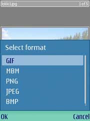
Image Converter Example This example demonstrates how to use the image conversion APIs available in the S60 platform (Image Conversion Library, ICL). These APIs include important classes, such as CBitmapRotator and CBitmapScaler to be used for rotating and scaling images, respectively. CImageEncoder and CImageDecoder classes are used to access image encoders and decoders available in the ICL. With this example an image can be opened either from the device memory or a memory card (if present). Once opened, the image can be rotated, scaled, and saved in the same or a different format (for example, a JPG image can be converted into a GIF image). The UI of the updated application has been optimized for touch. For example, long taps and tactile feedback are supported. The example project supports building for both S60 5th Edition with touch UI and S60 3rd Edition with a traditional keypad. Important classes: CAknLongTapDetector, MTouchFeedback, CBitmapRotator, CBitmapScaler, CImageEncoder, CImageDecoder, CFbsBitmap, CAknQueryDialog.

Free Download: S60ImageConverter.zip
Read More >>

BlackBerry Storm 9530

Designed to satisfy the needs of both consumers and business customers, the BlackBerry Storm smart phone offers a revolutionary touch screen that dramatically enhances the touch interface and enables easy and precise typing. The world's first "clickable" touch screen responds much like a physical keyboard and also supports single touch, multi touch and gestures for intuitive and efficient application navigation.

Whether traveling to Europe or Asia, the Storm provides globetrotters the freedom of reliable global connectivity with Verizon Wireless's reliable, high speed 3G CDMA network here in the United States and compatibility with GSM networks abroad. The SurePress touchscreen with tactile click response allows you to accurately navigate and type messages on the BlackBerry Storm.

The Storm's built in accelerometer automatically switches the screen between landscape mode and portrait modes as it rotates. It's compatible with the V Cast Music and V CAST Music with Rhapsody services, which enables you to purchase songs through your phone and download them via Verizon Wireless's fast EV-DO data network. You'll also benefit from the phone's A-GPS receiver, which enables you to access Verizon Wireless's VZ Navigator service for turn by turn directions.

Other features include a 3.2 megapixel camera and camcorder, Bluetooth connectivity for handsfree devices and stereo music streaming, 1 GB internal memory, MicroSD memory expansion to 16 GB, support for up to 10 personal and corporate email accounts, access to popular instant messaging services, and up to 6 hours of talk time.
Read More >>

Monday, January 26, 2009

Sony Ericsson W760a

This AT&T phone can handle high speed data connectivity via AT&T's 3G mobile broadband data network, which is available in most major metropolitan areas. The AT&T 3G network uses the dual band UMTS 850, 1900 MHz network, and this phone is also compatible with 2100 MHz 3G networks (found in international territories).

The AT&T 3G network provides download speeds ranging from 700 Kbps to 1.7 Mbps, and upload speeds ranging from 500 Kbps to 1.2 Mbps. This makes it possible to enjoy a variety of feature rich wireless multimedia services, and it gives you the advantage of offering simultaneous voice and data services. (For use outside the United States, an AT&T international data plan is recommended.)

In areas where the 3G network is not available, you'll continue to receive service on the AT&T EDGE network, which offers availability in more than 13,000 US cities and along some 40,000 miles of major highways. Providing average data speeds between 75-135Kbps, it's fast enough to support a wide range of advanced data services, including video and music clips, full picture and video messaging, high speed color Internet access, and email on the go.

You'll also enjoy quad band GSM connectivity, which allows you to make calls in more than 190 countries and access data applications in the more than 135 countries where AT&T offers international data roaming.

With 3G connectivity, you'll be able to access AT&T's Video Share service, which enables you to send a live, one way video stream to another compatible phone during a standard voice call.

The service also allows you to switch the direction of the video stream during the same phone call. (Customers must be in an area served by the company's 3G network and have a Video Share enabled phone.)

A majority of users in the architecture, engineering and construction industries rated the ability to share live video through Video Share highly, according to research commissioned by AT&T.

Video Share lets you see progress on a job site or review the day's work without having to drive from an office or other site to do so. You can take advantage of the AT&T Navigator GPS software and service, a full featured premium navigation application that includes audible turn by turn directions, real time traffic updates and re-routing options, and 3D moving maps (additional charges applicable).

AT&T Navigator offers several other features to make your commute more enjoyable and reliable, including mobile access to Yellowpages.com. Additionally, AT&T Navigator is the only mobile phone based GPS service that provides integrated speech recognition for address entry and points of interest search. With 3G connectivity, you'll be able to access AT&T's Cellular Video (CV) service and the Internet while on the go.

Cellular Video features content from CNN, The Weather Channel, iFilm, Comedy Central and exclusive premium content from HBO and much more. And you get access to AT&T Mobile Music, which enables you to buy tracks while on the, access the Napster and eMusic subscription music services, stream music video, discover what's playing with Music ID song recognition software, and find out what's hot with The Buzz music news portal. (A MEdia Max subscription bundle is recommended for accessing AT&T's Internet, video, and music services.)
Read More >>

Sony Ericsson Z525a

Sony Ericsson's reputation for cutting edge design is well represented with the Z525a. There's a 128 x 160 display housed under the cover while the outside sports a supplementary 101 x 80 color screen that can display time, call information, battery and signal strength, and more. The VGA (640 x 480) camera is housed on the front cover as well. The z525a uses an internal antenna nothing to snag or break off and a five way button just above the dial pad is used to control most of the phone's menus and features.

Up and down buttons on the left side of the phone can be used for quick volume control and menu navigation. USB data and charging ports, as well as a headset port, are located on the phone's bottom edge.

And because the z525a's front and rear face plates are changeable with Sony Ericsson Style Up covers, you can dress it up to suit your style. Color light effects around the keypad complete the calling and messaging experience.

The Z525a's phone book can hold up to 510 contacts with multiple entries per contact. A call list remembers your most recent missed, received and dialed calls.

The phone's voice activated dialing makes calling your friends, family and associates as easy as saying their names. The phone also features a speaker phone for easy, hands free talking.

In addition to a vibrating alert, the phone supports polyphonic ringtones as well as MP3 ringers, allowing you to use portions of your favorite songs to alert you to incoming calls. There's even a bundled application that lets you mix your own ringtones with up to 16 tracks. Meanwhile, more ringtones can be downloaded from Cingular's MEdia Net wireless web service. Picture caller ID lets you assign a photo to specific callers. Similarly, a ringer ID lets you assign ringtones to callers. And don't forget that the Z525a's Bluetooth radio lets you use a wide range of wireless headsets for hands free calling.

Cingular Push To Talk is a walkie talkie type service that allows you to instantly reach others by eliminating the dialing and ringing steps in a regular cellular call. Push to talk calls can be made to one person or to a group of people. Choose Cingular Push To Talk as an add on service to your voice plan to enable the service on the Z525a. Cingular's unique service allows you to see who is available before you initiate a call. Plus, you can place yourself in "do not disturb" mode if you do not want to receive push to talk calls.
Read More >>

Sony Ericsson Z310a

In addition to making crystal clear calls, with the Sony Ericsson Z310a in hand you can send and receive email, browse the Web, synchronize your PC calendar and contacts, and more. Built in Bluetooth technology offers wireless freedom for hands free headsets and PC downloads. Other great features include a rounded clamshell design with an internal antenna, a VGA camera, RSS reader, EDGE data, a speaker phone, disappearing front indicators, an external display, and more.

With its quad band connectivity, this phone communicates over GSM or GPRS networks and AT&T offers voice roaming in more than 190 countries and data roaming in more than 130 countries. The Z310a's 65.000 color, 128 x 160 display is housed under the front cover while the semi transparent front of the clamshell sports a hidden display (measuring 96 x 64 pixels in monochrome) that can display time, caller information, and more.

Located just above the outer display are unique disappearing backlit indicator icons that indicate battery and signal strength, message status, and multimedia status. The indicators fade away when not in use, leaving the phone's outer interface clean and sleek looking. The handset's VGA camera is housed on the front cover as well, just above the indicator icons.

The Z310a uses an internal antenna leaving nothing to snag or break off and a five way button just above the dial pad is used to control most of the phone's menus and features. Up and down buttons on the left side of the phone can be used for quick volume control and menu navigation. USB data and charging ports, as well as a headset port, are located on the phone's bottom edge.

The cover includes a monochrome display as well as backlit indicator icons that show battery and signal strength, message status, and multimedia status. The Z310a's call list remembers most of your recent missed, received, and dialed calls. The phone also features a speaker phone for easy, hands free talking. In addition to a vibrating alert, the phone supports polyphonic ringtones as well as MP3 and AAC format ringers, allowing you to use portions of your favorite songs to alert you to incoming calls.

There's even a bundled application that lets you mix your own ringtones with up to 16 tracks. Picture caller ID lets you assign a photo to specific callers. Similarly, a ringer ID lets you assign ringtones to callers. Lastly, the phone also comes with conference call capabilities an ideal feature for both business and leisure applications. Because the Z310a is Bluetooth enabled, wireless communication headsets can be configured with the phone for total hands free operation.

The phone comes with a built in email client with support for POP3 and IMAP4 protocols, while the included Access NetFront Web Browser allows you to surf full HTML web sites. It also supports RSS feeds, allowing you to use your phone to view up to the minute news and other content from selected Web sites and blogs.

Just subscribe to the feed and let it come to you. Support is built in for sending and receiving text, video, graphics and sound via messages. T9 text entry, a technology that makes it easier for people to enter words and text on handsets, is built into the unit a plus for mobile email and text messaging users.
Read More >>

EssentialSoccer for Java phones

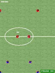
EssentialSoccer for Java phonesEssential Soccer is the fastest and most playable mobile football (soccer) game with simple and unique controls.

Play as your favorite of 48 international teams. Use the strengths of the 768 individually skilled players to perform some amazing moves; including headers, vollyes, crosses and one-touch play.

Nothing beats the feeling of scoring a winning last-minute goal with a flying header.

Free Download: esoccer-240.jad and esoccer-240.jar

via: rodrigostoledo.com
Read More >>

Sunday, January 25, 2009

Apple First Quater Results Turned In for 2009

Apple has announced their financial results for the fiscal 2009 first quater which ended on December 27, 2008. With these results Apple posted a record revenue of $10.17 billion and a record of$1.61 billion in net quarterly profit which comes out to $1.76 per diluted share. According to Apple these results match up against last years $9.6 billion in revenue and $1.58 billion in net quarterly profit, or $1.76 per diluted share. This years gross margain was 34.7 percent, equal to last years and International accounted for 46 percent of annual revenue.

Apple recognizes revenue and cost of goods sold for the iPhone and the Apple t.v. over their economic lives in accordance with the subscription accounting treatment required by GAAP. The corresponding non-GAAP measures for this quater $11.8 billion of Adjusted Sales and $2.3 billion of Adjusted Net Income due to Apple adjusting GAAP salesproduct costs to eliminate the impact of subscription accounting.

Representing 9 percent unit growth over the year-ago quater is the fact that Apple sold 2,524,000 Macintosh computers during the quater. Apple also sold a record 22,727,000 iPods during the quater which represented a 3 percent unit growth over the year-ago quater. And representing 88 percent of unit growth over the year-ago quater was the iPhone which sold 4,363,000 units.

Apple CEO Steve Jobs stated, "Even in these economically challenging times, we are incredibly pleased to report our best quarterly revenue and earnings in Apple history, surpassing 10 billion in quarterly revenue for the first time ever." Apple CFO Peter Oppenheimer also had this to say, "Our outstanding results genertated $3.6 billion in cash during the quater. Looking ahead to the second fiscal quater of 2009, we expect revenue in the range of $7.6 billion to $8 billion and we expect diluted earnings per share in the range of $0.90 to $1.00."

Apple seems to be doing very well for themselves reporting record statistics. With the new year starting, a new President taking office, and Steve Jobs temporarily stepping down we can only speculate at what will happen next for Apple
Read More >>

Boot from VHD. Windows 7 and Windows 2008 R2

Read More >>

Saturday, January 24, 2009

Peformance SQL 2008 Cluster and Windows 2008 iSCSI SAN

Hi

I setup a Windows 2008 Cluster with SQL 2008 cluster over Equallogic iSCSI SAN.
I switch the node and I lost a ping.


You can read the cmd box. The yellow line is the ping losted.
Yes, Yes. The SQL instance was 13-14 seconds down.
Yes, Yes . The SQL was just installed, so, I havent any database.
I am going to set up this lab with Hyper-V. That is. SQL in Hyper-V machines to measure the performance as well.
I am going to test this lab with a radio database. Xframe is the piece of software that we use in our radio company . I will test the same.
More information in the next post, or by email ;-)
sAntos

Read More >>

Windows 2008 and SQL 2008 in Cluster.

Hi everyone

This lab runs very well.

But, I would like to share some problems to set up this lab:

a) You need .NET Framework 3.5 SP1. If SQL Wizar doesnt launch the setup, you cand installed from the SQL DVD. DVD:\x64\Redist\DotNetFrameworks\dotNetFx35setup
b) Same for Windows Installer 4.5. DVD:\x64\Redist\Windows Installer\x64\Instmsi45
c) You need install Powershell as well from Features console.
d) I got a IP duplicate error. Teredo Tunneling Pseudo-Interface got the guilty.
Verifying that there are no duplicate IP addresses between any pair of nodes.Found duplicate IP address . . . . .

Links that I followed to solve the problem.
http://sqlblogcasts.com/blogs/justinl/archive/2008/08/20/windows-2008-cluster-validation-failure.aspx
http://www.networkworld.com/community/node/29037
http://thesource.ofallevil.com/communities/newsgroups/list/en-us/default.aspx?dg=microsoft.public.sqlserver.clustering&tid=2b62061f-c050-4a82-be30-9677de59a2bc&cat=en_us_947fd056-7098-4a44-a742-6c6224603cb1&lang=en&cr=us&sloc=&p=1


set devmgr_Show_Nonpersistent_Devices=1

devmgmt.msc

ncpa.cpl

I switched off the teredo Tunneling ghosted NIC.
I uninstalled the teredo tunneling ghosted NIC.
Device manager NICs and ncpa console must show the same devices.


d) I got a warning about binding NICs.

NOTE: You need to push Alt+N in English or Alt+A to show the advanced menu.
You need to enter in the advanced features and change the binding order.


After these problems, the installation was right.


PS: The Windows 2008 cluster was with a witness share resource and the sQL saves in a iSCSI Equallogic Dell SAN.
sAnTos
Read More >>

Windows Server 2008 R2 and SQL 2008 Cluster Error

hi

Yes, I am very daring.

I was installing Windows Serve 2008 R2 and SQL Server 2008 in Cluster.

Windows Server 2008 R2 was well.
Cluster W2008 R2, was well.
SQL 2008 Clusterd was bad, very bad.

At the end of the process I got this error:

Require Kerberos to value 1

I didn´t find a solution
I think is for Windows 2008 R2.

The same lab over Windows 2008 runs well, very well.

sAnTos
Read More >>

Sony Ericsson S500i

As we mentioned, the S500i is a very stylish and eye catching handset. It has a classy and sophisticated appearance, and there are even glowing LEDs along the sides whenever it's activated, making it appear extra sparkly. Not only is the S500i sleek, it's also compact, measuring only 3.9 inches by 1.8 inches by 0.5 inch and weighing about 3.3 ounces. The S500i is one of a few phones that Sony Ericsson has manufactured in a slider design, the others being the W580i and the W850i.

We like the slider mechanism quite a bit the movement was smooth yet sturdy, and didn't feel too loose at all. There is a slight sloping curl along the chin of the phone that you can use to push the phone open, and to close it, you can slide your thumb down on the raised toggle making the entire sliding process completely one handed. The Sony Ericsson S500i has a 2 megapixel camera on the back. The beauty of the S500i's display can't be denied.

It measures a little more than 2 inches diagonally and supports 262.000 colors and a lovely 240x320 pixel resolution. Colors popped from the screen and images showed up well.

You can adjust the phone's brightness and that's about it. Underneath the display is the navigation array, which consists of two skinny soft keys, a circular toggle with a central OK key, a Back key, a Clear key, a dedicated Web access key, plus a key dedicated to opening a My Shortcuts menu.

The circular toggle also doubles as four user defined shortcuts. Even though we found the toggle easy to use, we thought the surrounding keys felt a bit too small for our taste. This is especially true for the two soft keys, which are extremely skinny. Slide open the phone and you'll find a pretty decent number keypad. We were surprised that the keys weren't as flat as most keys on slider handsets.

There was noticeable textural difference between each tile like key, and the keys have a nice give when pressed. That said, the keypad did feel a tiny bit crowded and some users have complained about the keys cracking, though that was not a problem we encountered. There's a lovely white backlight emanating from the keypad when the phone is activated.

A slim volume control rests on the left spine, while the charger or headset jack is on the right. On top of the S500i is the memory stick slot plus the Power button. We wished the Power button was a bit larger, but it wasn't too difficult to press. Also, if you slide up the phone, you'll reveal a camera lens on the back of the phone. There's no flash or self portrait mirror, however.
Read More >>

Sony Ericsson Z750a

Like many Sony Ericsson phones, the Z750a comes in multiple colors phantom gray and rose pink. The pink version, which we examined, isn't as garish as the pink model of the Z310a, but it's still bright and shiny. It shows your reflection, albeit a rose tinted one, and like any mirror, it attracts fingerprints. We weren't crazy about it, to be frank, but it's certainly eye catching. As stated above, the Z750a is a tad bulky, but not excessively so.

It measures 3.8 inches by 1.9 inches by 0.8 inch and weighs 3.9 ounces. It fits in comfortably, but the outer plastic casing felt a bit flimsy. The Z750a's external display is similar to the Z310a's.

Though it's invisible when the back lighting is off, a quick flick of the left spine volume rocker makes it appear in the center of the front face. It's a unique touch, particularly since the display has a vertical orientation, but we didn't love it.

Though the display shows the time, battery life, signal strength, and number caller ID, it's rather small when compared with the phone's overall size.

That means that the text is also small and that the screen won't show photo caller ID or work as a viewfinder for the camera lens. Also, the display is difficult to see in direct light.

Like most Sony Ericsson phones, the Z750a has an excellent internal display that measures 2.25 inches (240x320 pixels) and supports 262.144 colors. Colors were vibrant and images were crisp, though the display can be difficult to see in direct light. You can change the brightness and the clock size, but none of the other options are customizable.
Read More >>

Sony Ericsson P1i

The Sony Ericsson P1i has the familiar design of many of the company's cell phones but most closely resembles the M600i. The candy bar shape smart phone is compact and light at 4.1 inches by 2.1 inches by 0.7 inch deep and 4.4 ounces, and sports a traditional but attractive silver and black casing. It's certainly a huge improvement over the bulky P990i. With a solid construction, the P1i is comfortable to use as a phone, and it has a nice soft touch finish on the back to make it easier to grip.

It also won't make too much of a tight fit in a pants pocket. The Sony Ericsson P1i next to the RIM BlackBerry Curve. The P1i boasts a beautiful 2.6 inch display that shows off 262,144 colors at a 320x240 pixel resolution. It's sharp and bright, and you can adjust the backlight timer, theme, wallpaper, menu style (grid or list views), and more to suit your personal style. Even better, it's a touch screen, so you can enter data, navigate the various menus, and launch applications with just touch of your finger or stylus.

For the most part, the screen was responsive to our commands, though the smart phone's somewhat sluggish performance originally had us thinking otherwise (see Performance section for more). Like the Sony Ericsson M600i, the P1i features a dual function rocker style keyboard that's surprisingly easy to use. Given the smaller footprint, the Sony Ericsson P1i doesn't have a full QWERTY keyboard but sports the dual function rocker style keyboard like the M600i's.

(You also have the option of entering text using the onscreen keyboard or handwriting recognition system.) There are two letters per key, and if you press it to the left, it inputs one letter pressing it to the right enters the other letter. Admittedly, it takes a bit of acclimation to use the keyboard, but not as much as one would think. We got the hang of it pretty quickly, and the tactile buttons are large and have a fair amount of spacing between them for easy typing.

The number buttons are outlined in red to help you locate them in a sea of black. Unlike many smart phones today, there are no dedicated Talk and End keys on the P1i, so you'll have to use the touch screen to make and end calls. There's also no navigation toggle, but you do get a scroll wheel on the left spine (as well as a back button and a cell phone strap loop) that you can depress to select an item.

Though this control allows for easier one handed use, we did miss having the directional keypad and we often found ourselves having to use the jog wheel for one task, the touch screen for another, and the keyboard for yet another function it just wasn't the most seamless experience and got to be frustrating.

On the right, you'll find a customizable shortcut button, a proprietary Sony Memory Stick Micro (M2) expansion slot, and a camera activation key. The camera lens and flash are located on the back, while there is a connector for the AC adapter and headset on the bottom. Of the latter, Sony Ericsson uses a proprietary port, so that's a bit of annoyance particularly where the headset is concerned.
Read More >>

Sony Ericsson W880i

Sony Ericsson was relatively late to the thin phone craze, but the W880i certainly would qualify as a svelte model. At 4 inches by 1.8 inches by 0.4 inch, it's extremely slim and sleek, but it fits comfortably in the hand. It's also light (2.5 ounces) but has a solid and sturdy feel. The phone comes in two color schemes a black and orange version and a silver and black model. We examined the former in this review, but our observations apply to either handset.

The W880i's display measures 1.75 inches and supports 262,144 colors. It's bright and vivid and displays everything form text to graphics well. You can only change the brightness, so users with visual impairments may want to test the phone first. The dialing text is large, but the messaging text is quite small. The menu system is uncomplicated and free of heavy graphics and animation.

Unfortunately, that's where the W880i's design good points end. We'll start with the navigation controls first. The problem isn't that you don't get enough keys rather it's that those keys are just too small.

The orange and silver navigation toggle and central OK button are the least offending of the bunch. Both are raised above the surface of the phone, and the toggle's top and bottom edges have tactile ridges.

Yet we'd still prefer something bigger. The toggle can be set as a shortcut to four user defined functions, and it doubles as a control for the Walkman player.

Surrounding the toggle are two soft keys, back and clear buttons, a Web browser shortcut, and an Activity control that opens a handy shortcuts menu. Like the toggle, these keys are tactile, but they're just too small.

More than once we pressed two keys accidentally. Per usual Sony Ericsson practice, there are no dedicated Talk and End buttons (the soft keys perform those functions), but the placement of the power control baffled us. Rather than featuring a dedicated power button (another Sony Ericsson hallmark), the W880i combines it with the clear button.

Though that's not the most ideal combination, we were more concerned with finding the control in the first place. The power icon is so small and so hard to see that we had to consult the manual to turn the phone on. And even when powering the phone the second time we had to look closely to find it again.
Read More >>

Sony Ericsson W810i

For the navigation keys, the W810i takes a different design approach than it did with the W800i and W600i. Besides scrolling through the attractive, user friendly menus (available in four styles), the sliver, circular navigation toggle serves as a shortcut to four user defined functions in standby mode. Also, when in Walkman mode, the toggle acts as your tool for scanning through your music list. In the middle of the toggle is a raised OK button that resembles a tiny joystick.

In addition to opening the main menu, the OK button is the play or pause control for the music player. Overall, both controls are tactile and easy to use, and we like that they're raised above the surface of the phone. On the downside, however, they're a bit small, especially for users with larger mitts. On either side of the toggle are two soft keys, a Clear button, and a Back key. In standby mode, the soft keys open the main menu and the Recent Calls list.

They're stiff to the touch, however, and it should be noted they double as the Talk or End controls. Sony Ericsson tends to forgo dedicated Talk or End keys it's not our favorite arrangement, but you get used to it. The final two buttons are an orange Walkman key that turns the media player on and off and a silver control for opening a user programmed shortcuts menu.

In all, the generous shortcut options are welcome. We've knocked Sony Ericsson in the past for its poorly designed keypads, but we're happy to report that the company got it just about right this time around. Instead of recessed or flat buttons, the W810i's keypad is raised above the surface of the phone, making it easy to dial by feel. The keys are spacious, and our only real complaint is that the orange back lighting was rather dim.

Completing the outside of the phone are a music player button and a Memory Stick Pro Duo slot on the left spine, a camera control and a volume and camera zoom toggle on the right spine, and a dedicated power button and the infrared port on top. On the bottom of the phone is the port for both the charger and the headset, which means you can't connect two peripherals at the same time.

The camera lens, flash, and self portrait mirror are on the back of the phone just above three round speakers. As with the W800i, you can hold the W810i much like a real camera to take a picture.

Like other Walkman phones, the Sony Ericsson W810i is packed with features that will appeal to multimedia mavens, but we'll get the basics out of the way first.

The phone book holds an impressive 1,000 contacts with room in each entry for five phone numbers work title and company name a birth date additional notes and email, Web, work, and home addresses. You can save 250 more names to the SIM card. You can assign contacts to a caller group and pair them with a picture or one of 23 polyphonic (40 chords) ring tones for caller ID purposes.

A vibrate mode, conference calling, voice dialing, and a speaker phone (usable only after you make a call) round out the calling options. Organizer features include an alarm clock, a calendar, a task list, a notepad, a calculator, a timer, a stopwatch, and a code memo for storing passwords and other secure information. And for the aspiring Linda Tripp, there's a recorder for both voice memos and calls length is limited by available memory. Finally, as with the Sony Ericsson W600i, the camera flash doubles as a tiny flashlight.

Though it's not suitable for finding your way through the woods at night, it's bright enough to help you find your keys in a dark room. Alternatively, you can set it to blink rapidly in SOS mode. Business users shouldn't be disappointed with the W810's offerings. Inside, you'll find full Bluetooth for headsets and data transfers, an infrared port, text and multimedia messaging, email support, USB cable support for data transfers, and PC syncing for contacts and other files.

In addition to sending files or connecting to a headset, you can use the Bluetooth feature as a remote control to connect with another Bluetooth devices. An unusual twist, there's a newsreader for access to news feeds from around the world. Access to BBC World News and Wired News came with the phone, but you van download more feeds if you want them.

The W180i also makes it easy to pass on your contact information by allowing you to beam an electronic business card with your vital data to a contact. Music, of course, is the primary attraction on the W810i, and the player's features, controls, and interface are the same as on other Walkman phones, but they take a little acclimation. Opening the player takes you directly to the main menu, where you can organize music by artist, track name, or playlist.

Settings include album or song shuffle and loop, Sony's Mega Bass, an equalizer, and stereo widening. Switching between the cell phone and the music player is seamless, as music automatically stops when you receive a call. Hang up and press the dedicated music key, and your song picks up from the point you left off.

There's an airplane mode that lets you listen to your tunes in flight with the cell phone turned off, and you can minimize the player while using other functions. Again, you must download music from a PC with the included USB cable and Disc2Phone software, and the W810i doesn't support Bluetooth stereo profiles; Sony Ericsson says it will resolve the latter gripe, however, in near future models, so stay tuned.
Read More >>

Sony Ericsson W980

With so many slider and candy bar Walkman phones, the sleek styling of the W980 is a welcome diversion. The shiny, black skin catches the light without attracting fingerprints or smudges and the clean lines give the handset an attractive edge. Another cool design touch is a quarter inch of clear plastic on the bottom of the front flap. Sure, it's slightly gimmicky, but it's also eye catching and we like how the embedded lights flash when you get a call and when music is playing.

At 3.6 inches tall by 1.8 inches wide by 0.7 inch deep and weighing 3.5 ounces, the phone travels well and fits comfortably in the hand. What's more, the hinge mechanism also feels solid. We noticed, however, that the plastic battery cover feels a bit flimsy and is rather difficult to remove. The external display measures a generous 1.5 inches. It won't support photo caller ID, but it shows the date, time, battery life, signal strength, and numeric caller ID.

None of display's options are adjustable, including the back lighting time. Below the display are the dedicated music controls, which have a design of three overlapping circles. The controls are touch sensitive, so there is little tactile definition besides the center circle being slightly recessed. As expected, you can manipulate all aspects of the player and radio without ever opening the phone.

It makes for a comfortable user experience, yet we had one complaint. When you close the W980, it goes directly into music mode with the external controls activated. It then remains in music mode until you switch to standard mode or activate the locking switch. It was a little annoying, and if there is a way to change it we couldn't find it.

The aforementioned locking switch sits on the left spine below a rather stiff volume rocker and the control that changes the handset from music mode to standard. Twin speakers sit on either spine, and the connection port sits on the right spine. Note that Sony Ericsson uses a proprietary connection for the charger, a wired headset, and a USB cable. Also, the combined port means that you can use only one peripheral at a time.

The camera lens sits on the rear face, which unfortunately is the same place we wanted to rest our finger when we were holding the phone to take a picture. It's also disappointing that you don't get a flash or a self portrait mirror for a 3.2 megapixel camera. The internal display measures 2.25 inches and supports 262.144 colors (320x240 pixels). Like most Sony Ericsson displays, it is bright, vibrant, and colorful, with sharp graphics and photos.

You can adjust the brightness and choose from a selection of menu styles. All of the styles are intuitive but the menu text might be a little small for some people. We were apprehensive about the navigation array typically that's where Sony Ericsson makes design missteps but the W980 pulls through.

The circular keys feature a four way toggle with a central OK button, two soft keys, Talk and End controls, a clear key, and a control that activates a user programmable shortcut menu. Though the controls are flush, they're tactile and easy to use, even if the calling buttons are a bit cramped.

You'll also find a dedicated power button and a Walkman control just below the array. The circular keypad buttons are also flat, but they have a spacious arrangement and a relatively comfortable feel beneath our finger. We could dial and text without any problems, but rapid texting felt a little awkward. The bright back lighting helps in dim situations, but dialing by feel is difficult.
Read More >>

Sony Ericsson TM506

The Sony Ericsson doesn't make a bold style statement, but that doesn't mean it's unattractive. Indeed, we liked its slim profile (3.7 inches tall by 1.9 inches wide by 0.7 inch thick) and its glossy black skin with the amber highlights. This phone would look at home both in the boardroom and in a nightclub. It's also relatively lightweight (3.4 ounces), but it has a comfortable feel and a sturdy hinge. Still, we had a few design gripes.

The external display is small, rectangular, and monochrome. As such, it won't work as a self portrait viewfinder and it can't support photo caller ID. It does show the time, battery life, signal strength, and numeric caller ID, but none of the display's options are customizable. Fortunately, one flick of the volume rocker on the right spine will reactivate the screen's back lighting.

In the right light, the phone's external skin will show some fingerprints and smudges, but they weren't noticeable most of the time.

Besides the volume rocker, there are few remaining features on the TM506's exterior. The Memory Stick Micro slot is in a convenient and readily accessible location on the left spine.

The camera lens sits just above the external display, the charger port rests on the bottom of the phone, and the TM506's single speaker is on the rear side.

Though the TM506's external display is disappointing, its 2.25 inch internal screen is bright, colorful, and vibrant. With support for 262,000 colors, it stands up to Sony Ericsson's long tradition of making great displays. Graphics, photos, and text show up well and gaming was a treat. You can change the brightness level and choose from three easy to use menu interface designs. Initially we were a little wary of the TM506's controls and keypad, but in use, they're not so bad. The circular toggle and central OK button are flush, but they're surrounded by a raised ring that gives them some definition.

The toggle doubles as a shortcut to four user defined functions. The Talk and End buttons, the camera shortcut, and the clear key are also flat, but their arrangement is spacious enough to prevent misdials. The thin sliver soft keys are raised slightly above the surface of the phone, but they're not as tactile as we'd like. There's a dedicated power button just below the keypad.
Read More >>

Sony Ericsson W350a

With straight lines and sharp corners, the Sony Ericsson W350a is just about a perfect rectangle, albeit a thin one at 4.7 inches by 1.7 inches by 0.4 inch. Sony Ericsson never jumped fully onto the slim phone bandwagon but the W350a certainly qualifies. It fits neatly in a pocket and it weighs just 2.8 ounces. The W350a comes in three color schemes electric black, ice blue, and organic white.

We reviewed the black model but the features are the same on both models. The W350a has an attractive display. At 1.8 inches, it's large for phone's overall size and its 262.144 color resolution makes it easy on the eyes. Colors were bright and vibrant and the text was easy to read. The interface is intuitive and you can choose from a number of menus styles. You can adjust the brightness as well. Unfortunately, that is the limit of the design highlights.

To begin with, the W350s is covered in a plastic shell that feels rather flimsy in the hand. This is not a phone we'd want to bang around.

But more importantly, we were confounded by the W350a's strange flap that covers the handset's navigation array and keypad. Since you must tilt the flap down to access the handset's controls, it makes the rectangular W350a something of a candy bar or flip phone hybrid.

Also, when the flap is closed, it protects the numeric keypad while presenting a dedicated set of Walkman controls. In fact, when the handset is closed it looks like standalone MP3 player.

Though it's an interesting and unique idea, the execution isn't so great. We like the idea of dedicated Walkman controls, especially when they allow you to play or pause tunes and scroll through your play lists, but on the W350a those controls aren't real buttons.

Instead, when you press the controls you're actually pushing through to the numeric keypad to make the command. What's more, the Walkman controls are flush and feel rather fragile. The construction of the flap made us worry about its long term durability. Not only is the hinge loose but the flap also doesn't lock into place when it's open.

And considering you must open the flap to do anything besides play music, we're worried that it would wear out fast. You can remove the flap completely if you like, though we're certain that Sony Ericsson wouldn't recommend it. And on a final note, when you close the flap the Walkman player begins automatically. We found no way to change that setting, which is annoying.
Read More >>

Thursday, January 22, 2009

LG Incite CT810

Measuring 4.21 inches long by 2.2 inches wide by 0.55 inch thick, the LG Incite is one of the shiniest handsets we've ever seen; its display is reflective when idle, similar to the one on the LG Shine, and the Incite's entire chassis has a mirror finish. You will definitely have a tough time trying to get fingerprint smudges off the phone, and there's no need for a self portrait mirror next to the camera, as the handset's surface itself can act as a mirror.

Like most touch screen handsets, the Incite has a minimalist appeal it is sleek and slim, with few external controls. It's also quite lightweight at 4.23 ounces, so it won't weigh you down, either. The LG Incite has a really reflective surface. Following the lead of other touch screen smart phones like the Samsung Omnia and the HTC Touch, the LG Incite's design is dominated by the large touch screen on the front.

The 3 inch diagonal screen is a 240x400 pixel resolution QVGA display with support for 262.000 colors, which makes for vibrant colors and sharp images.

It doesn't have the screen real estate of other handsets like the Samsung Instinct or the Apple iPhone 3G, but that's only really an issue when it comes to the Web browser (which we'll get to later).

You can adjust the screen's backlight time plus the font size. Because the display is so reflective, we have to say it can be a little tough to read the screen under direct sunlight.

The touch screen on the Incite has haptic tactile feedback, which lets you know, using vibrations, that your touch has registered. You can adjust the sensitivity of the touch response as well as the length and strength of the vibrations. Since the touch screen is resistive, you can use either your finger or the provided stylus to navigate through the screen. We found the touch screen to be mostly responsive, but we did notice some problems with lag sometimes it takes about half a second for a touch to register, which is a little longer than we would like.

We also found that we needed to be very precise in selecting something with the finger, lest we tap the wrong thing. The Incite does come with the aforementioned stylus for more accurate tapping, but we're not fans of having the stylus dangling off the corner of the phone. (You attach the stylus like you would a cell phone charm via a small lanyard.) The LG Incite also has a built in accelerometer, and the screen will change from portrait to landscape mode when you rotate the phone 90 degrees to either the left or the right.

Here again we noticed some lag issues. It occasionally takes about a second for the screen to fully rotate, which can be quite annoying. The Incite also has a proximity sensor, which shuts off the screen when you bring it to the side of your face, so as to prevent accidental taps. We also like that the Incite automatically adjusts the screen's luminance depending on the surrounding light.
Read More >>